Adom Brand
Public Made by Adomby adom
The Adom brand identity — logo, color, type, motion, sound, Kel, icons, and the design system every Adom product is built on.
Adom Brand
The single source of truth for Adom's visual identity — logo, color, type, motion, sound, mascot, icons, and the design system every Adom product is built on.
Updating old models is kind of our thing. — Come create with us.
This page supersedes the old Adom UI Branding skill (migrated from the Helium wiki). It folds in the full Kickstand brand guidelines, the animated logo + sonic mnemonic, the monochrome app-icon family, Kel the mascot, the deck design system, and the current design rules.
The logo
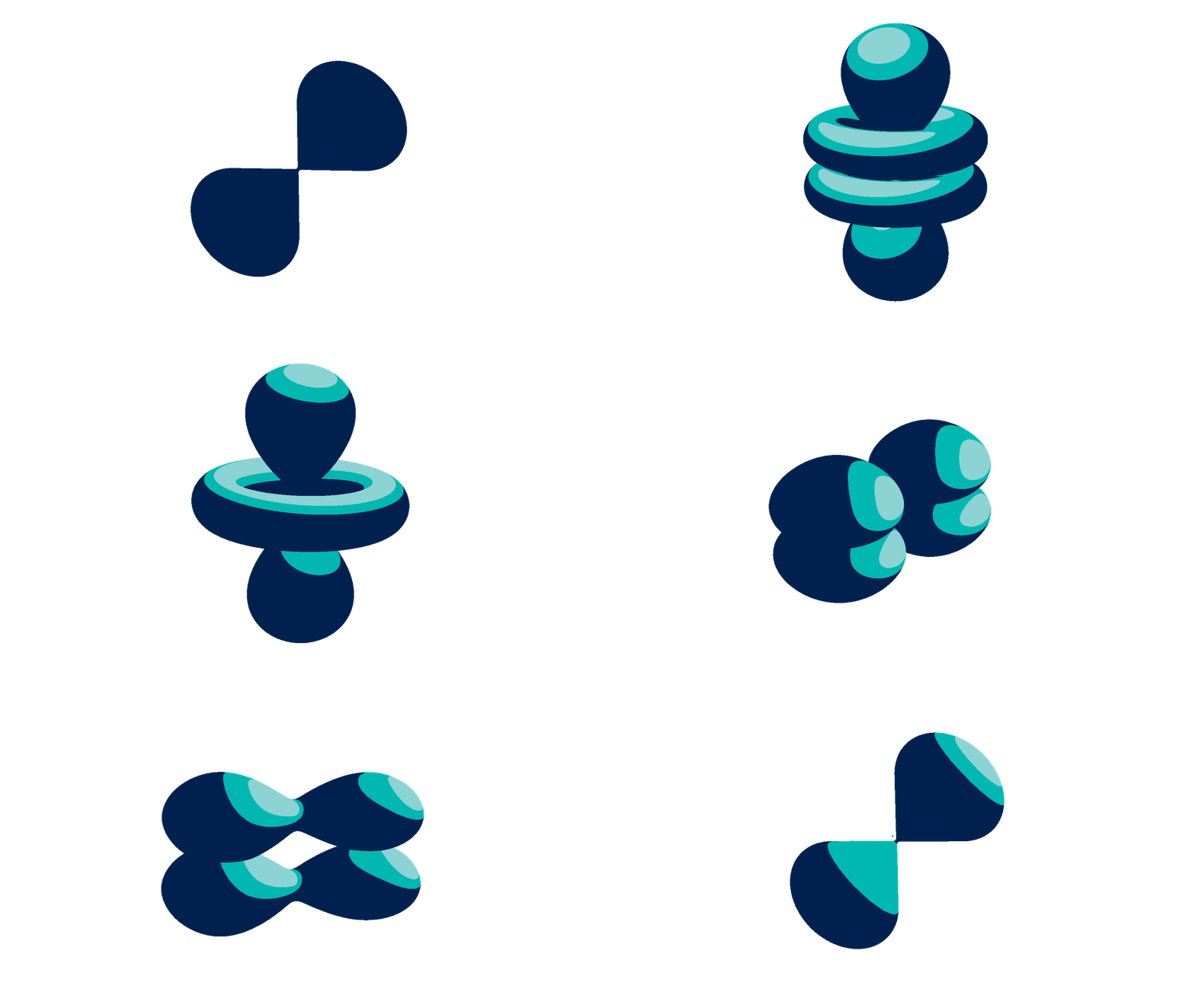
The Adom logoshape is a 2D rendering of the Schrödinger wave function for the hydrogen atom — not the outdated Bohr orbital everyone else draws. That atomic precision is echoed in the bonds between the letters of the custom-drawn wordmark.
And the spelling is intentional: "Adom," not "atom." To avoid accusations of pedantry, we spelled it wrong — added bonus, the trademark was available.
Five variants, one identity. Use Primary whenever you can.
| Variant | When to use |
|---|---|
| Primary | Default — full blue→teal→purple gradient wordmark |
| One Color | Busy / photo backgrounds. Teal #00B8B1 |
| White | Reversed, on dark backgrounds |
| Black & White | Non-color printing |
| Grayscale | Non-color printing, alternative |
| Favicon | When space is too small for the full logo |
Clear space: keep a minimum margin of one electron cloud (one lobe of the mark) on every side.
⛔ Never fabricate the logo. Use the real SVGs in
assets/(white / black / teal / icon) — never invent a stand-in, never a letter-in-a-box, never AI-generate the wordmark.
Color
Teal #00B8B1 is the primary accent. The signature gradient sweeps blue → teal → purple. Use RGB on screen, CMYK in print.
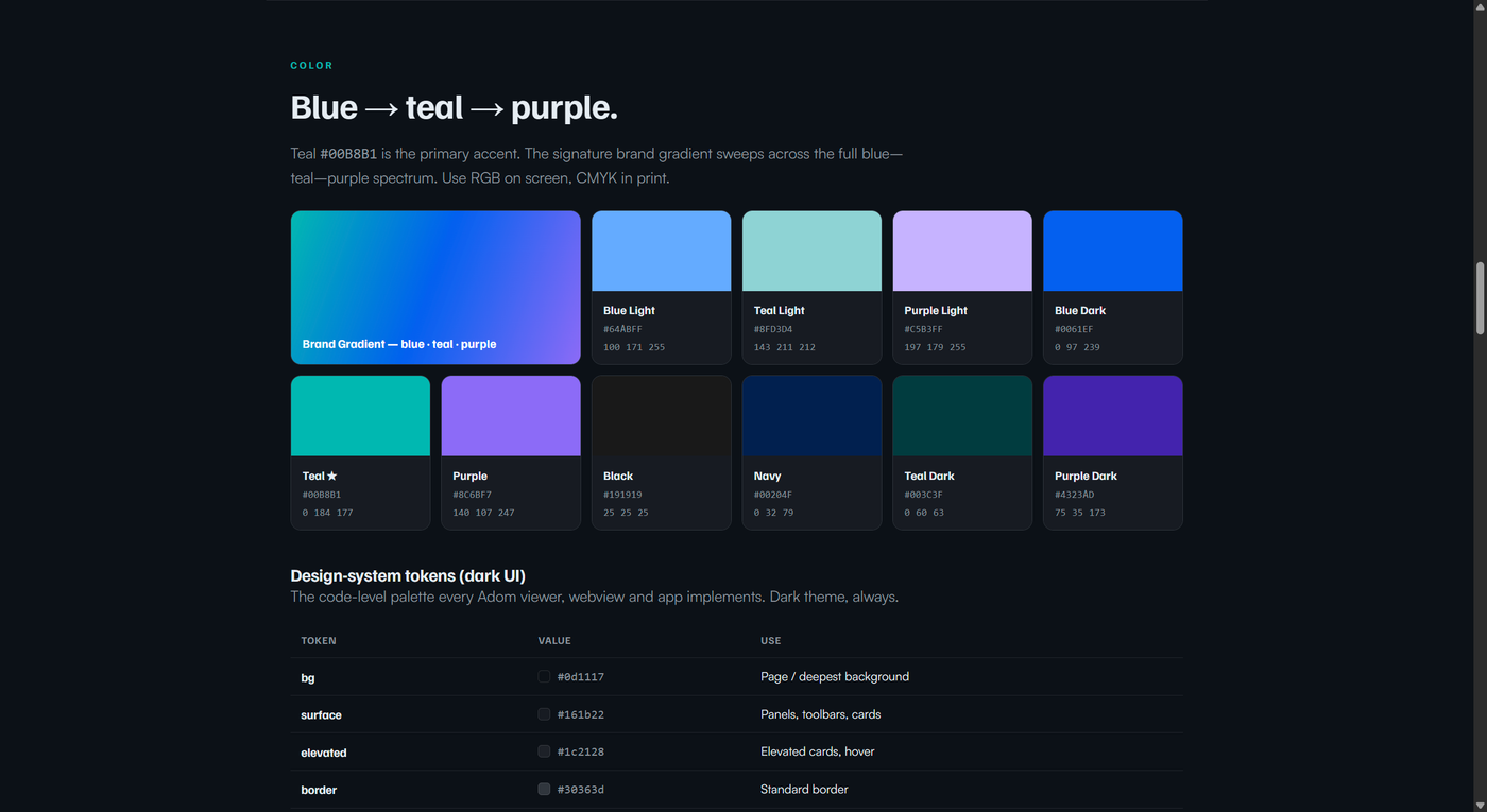
| Name | Hex | RGB | CMYK |
|---|---|---|---|
| Blue Light | #64ABFF |
100 171 255 | C54 M25 Y0 K0 |
| Teal Light | #8FD3D4 |
143 211 212 | C33 M0 Y0 K17 |
| Purple Light | #C5B3FF |
197 179 255 | C23 M29 Y0 K0 |
| Blue Dark | #0061EF |
0 97 239 | C83 M64 Y0 K0 |
| Teal | #00B8B1 |
0 184 177 | C74 M1 Y37 K0 |
| Purple | #8C6BF7 |
140 107 247 | C59 M63 Y0 K0 |
| Black | #191919 |
25 25 25 | C73 M67 Y65 K79 |
| Navy | #00204F |
0 32 79 | C100 M91 Y37 K40 |
| Teal Dark | #003C3F |
0 60 63 | C93 M57 Y60 K50 |
| Purple Dark | #4323AD |
75 35 173 | C84 M92 Y0 K0 |
Dark-UI design tokens (every Adom viewer/webview — dark theme, always): bg #0d1117 · surface #161b22 · elevated #1c2128 · border #30363d · text #e6edf3 · text2 #8b949e · accent #00b8b0 · accent-bright #00e6dc · purple #8C6BF7.
Typography
Familjen Grotesk for big, bold headlines. Satoshi for everything you read. JetBrains Mono for code.
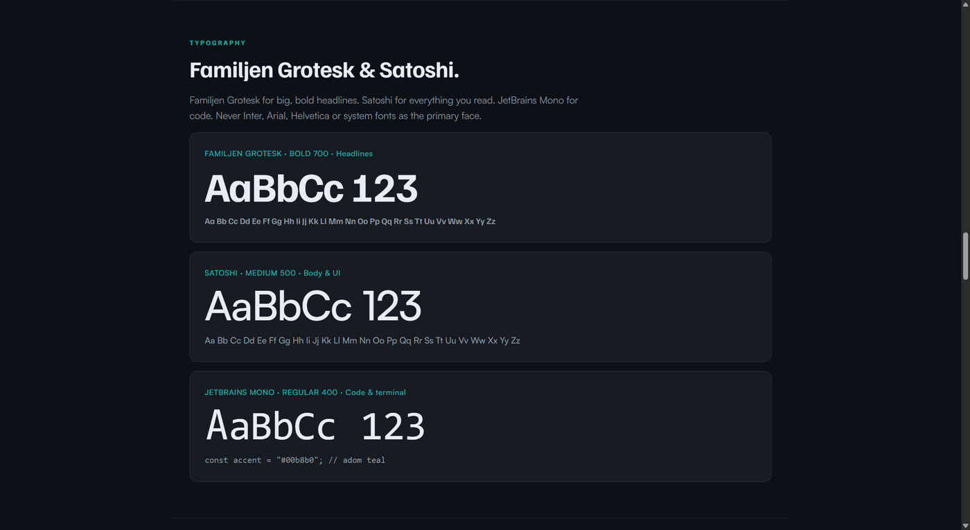
⛔ Never use Inter, Arial, Helvetica, or system fonts as the primary face. Brand fonts are hosted at
https://adom.inc/fonts/…and bundled inassets/— see the SKILL for copy-paste@font-faceblocks.
Motion & sound
The animated logo is the brand's signature moment — the wave-function lobes resolve into the mark — paired with a 4-second sonic mnemonic produced by Kickstand. Use them together for intros, splash screens, and loaders.
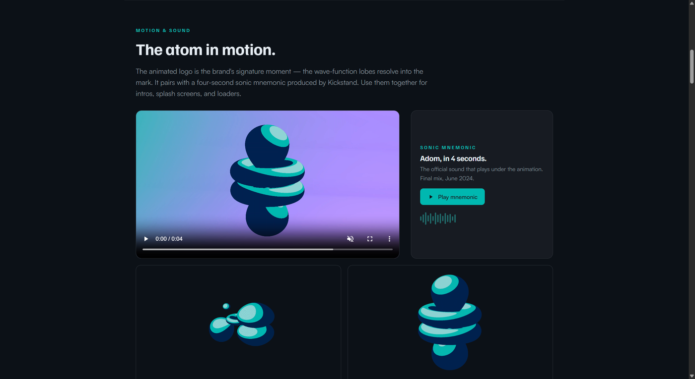
- Animation (web):
Adom-atom-final.mp4· loop mark · white bg - Animation (GIF): full lockup · mark only
- Sound:
adom-mnemonic-4sec.wav(Kickstand final mix, June 2024) - ProRes masters (transparent
.mov, 47 MB + 60 MB) exceed the wiki's 10 MB file limit — they live ingallia/brand/logos/Animated Logo/.

Icon system
Every Adom tool ships a custom, hand-drawn icon — single color (#e6edf3 / currentColor), 24×24 grid, no gradients, no drop shadows, no emoji. The whole family renders uniformly white to prove the rule.
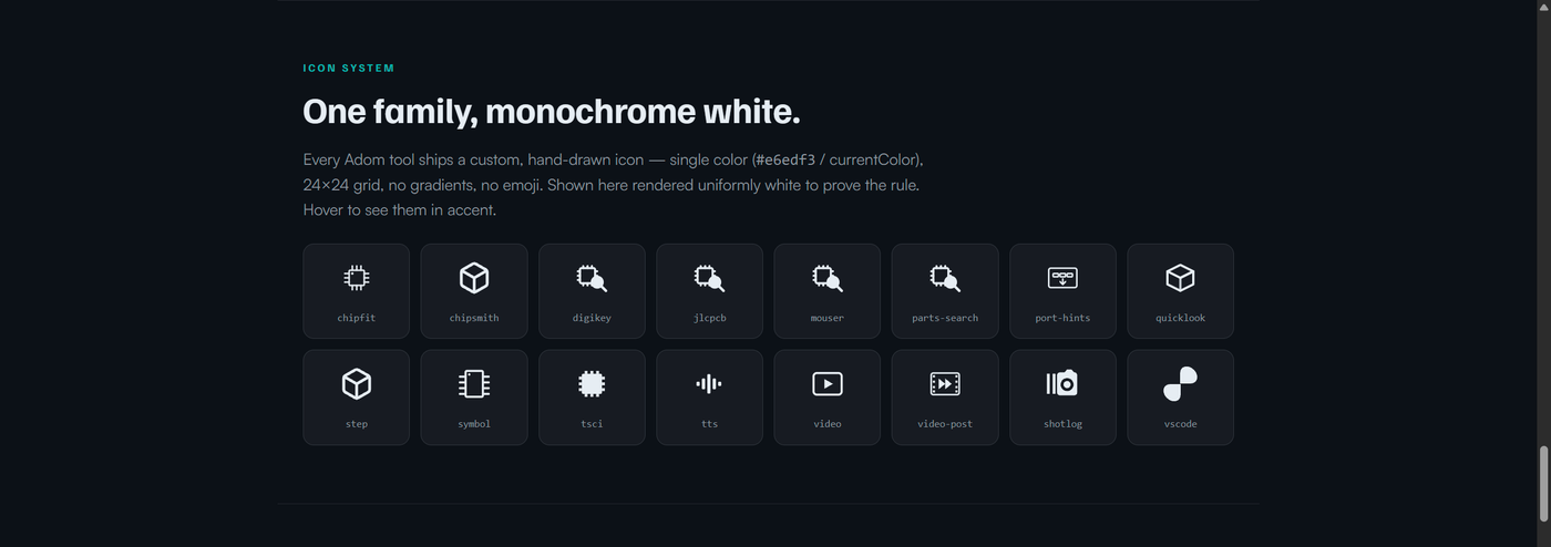
Source icons in icons/: chipfit, chipsmith, digikey, jlcpcb, mouser, parts-search, port-hints, quicklook, step, symbol, tsci, tts, video, video-post, shotlog, vscode — plus the favicon family in assets/.
Kel — the mascot
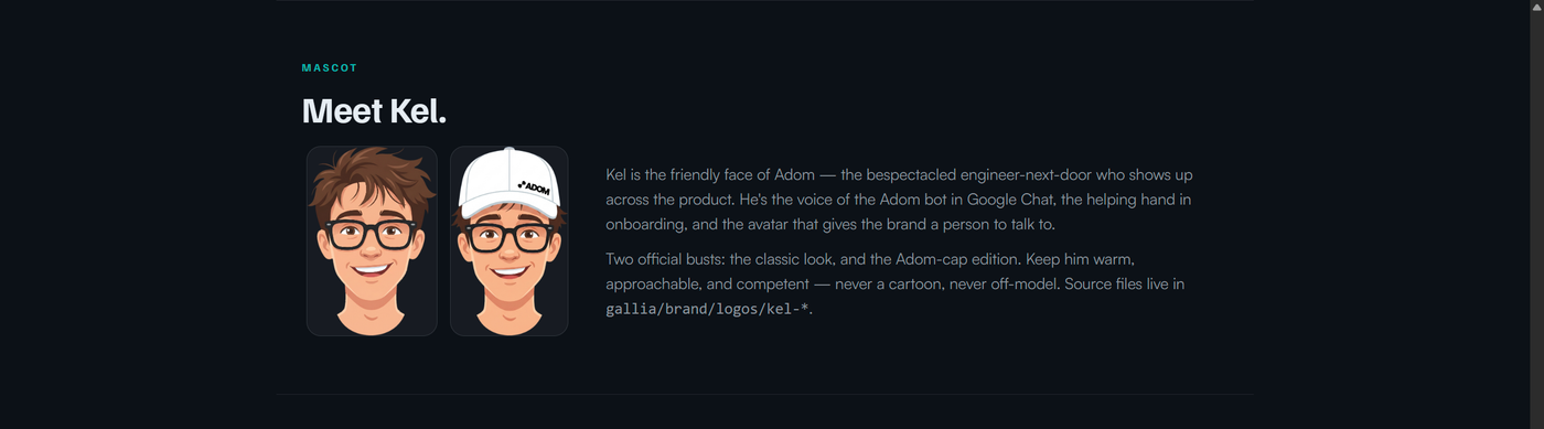
Kel is the friendly face of Adom: the bespectacled engineer-next-door who voices the Adom bot in Google Chat, helps in onboarding, and gives the brand a person to talk to. Two official busts — the classic look and the Adom-cap edition. Keep him warm, approachable, competent — never a cartoon, never off-model. Source: assets/kel-*.
Presentation & deck design
How Adom slides are built — reverse-engineered from the Kickstand-designed decks into a repeatable system. Full detail lives in the brand-deck skill — read it before making or restyling a deck.
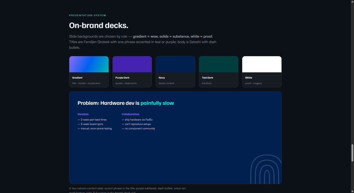
The core move: Familjen Grotesk titles with one key phrase accented in teal or purple; Satoshi body with dash bullets; backgrounds chosen by slide role — gradient = wow · Purple-Dark = quotes · Navy = dense content · Teal-Dark = solutions · white = proof. Layouts: title, statement/quote, two-column (the workhorse), single-column, image+text (squircle-masked images), nested-circle & cycle diagrams, three-column. The concentric-arc "onion" texture anchors the bottom-right corner of solid dark slides.
Tiling & patterns
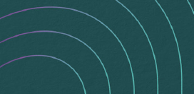
The background patterns Kickstand designed for Adom, taken straight from the brand guidelines — the business-card backs (PDF p13). Three motifs, all on dark teal/navy, used at low opacity behind content.
 |
 |
 |
|---|---|---|
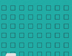
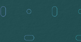
| Concentric arcs — radiating from a corner (teal→purple) | Square grid — fine outlined-square field | Pill field — scattered capsule outlines, teal with purple/blue accents |
Source crops: pattern-arcs.png · pattern-grid.png · pattern-pill.png. (Authentic vector source lives in Kickstand's files; these are lifted from the guidelines PDF.)
Design system — the rules
- Dark theme, always — page
#0d1117, panels#161b22. Never light backgrounds for primary viewer content. - Teal is the accent — highlights
#00b8b1 → #00e6dcon hover. Purple#8C6BF7for grouping. - Soft corners, smooth motion — buttons ≥ 6px radius, cards ≥ 10px; every hover transition
0.15s ease. - Frosted-glass surfaces —
rgba(22,27,34,.92)+backdrop-filter: blur(16px), subtle teal border, soft deep shadow. - Every icon monochrome white —
#e6edf3/currentColor; no colored icons, no emoji as UI glyphs. - Never fabricate the logo — use the real SVGs.
Full implementation detail (theme tokens, @font-face blocks, button/card/tooltip CSS, the pre-publish icon audit) is in SKILL.md — read it before any visual work.
Install the skills
adompkg install adom/brand
Drops brand + brand-deck into ~/.claude/skills/ so Claude Code reads the brand rules before generating any viewer, webview, mockup, deck, or marketing surface.
Talk to the AI
- Stay on-brand: "Read the brand skill, then make this page on-brand." · "Dark theme, teal accents, Familjen Grotesk headlines."
- Make a deck: "Make an on-brand Adom slide deck." · "What background for a problem slide?" · "Add the Adom corner texture to this slide."
- Look something up: "What's the Adom primary teal hex?" · "What font for body text?" · "Show the logo clear-space rule."
- Use the assets: "Play the Adom sonic mnemonic." · "Give me the animated logo MP4." · "Drop the Adom favicon into this app."
Downloads
| Asset | File |
|---|---|
| Brand Guidelines PDF (15pp, Kickstand) | pdf/Adom-Brand-Guidelines.pdf |
| Animated logo (MP4 / GIF) | animation/ |
| Sonic mnemonic (WAV) | animation/adom-mnemonic-4sec.wav |
| Logos & favicons (SVG/PNG) | assets/ |
| App icons (SVG) | icons/ |
| Deck template (PPTX) | deck/Adom-Deck-Template.pptx |
| Tiling patterns (SVG) | tiling/ |
Source: the Kickstand brand guidelines + decks + the gallia brand skill. Maintained on wiki.adom.inc.
# Adom Brand
**The single source of truth for Adom's visual identity** — logo, color, type, motion, sound, mascot, icons, and the design system every Adom product is built on.
> *Updating old models is kind of our thing.* — Come create with us.
This page supersedes the old `Adom UI Branding` skill (migrated from the Helium wiki). It folds in the full Kickstand brand guidelines, the animated logo + sonic mnemonic, the monochrome app-icon family, Kel the mascot, the deck design system, and the current design rules.
---
## The logo
The Adom logoshape is a **2D rendering of the Schrödinger wave function for the hydrogen atom** — not the outdated Bohr orbital everyone else draws. That atomic precision is echoed in the bonds between the letters of the custom-drawn wordmark.
And the spelling is intentional: **"Adom," not "atom."** To avoid accusations of pedantry, we spelled it wrong — added bonus, the trademark was available.
**Five variants, one identity.** Use Primary whenever you can.
| Variant | When to use |
|---|---|
| **Primary** | Default — full blue→teal→purple gradient wordmark |
| **One Color** | Busy / photo backgrounds. Teal `#00B8B1` |
| **White** | Reversed, on dark backgrounds |
| **Black & White** | Non-color printing |
| **Grayscale** | Non-color printing, alternative |
| **Favicon** | When space is too small for the full logo |
**Clear space:** keep a minimum margin of **one electron cloud** (one lobe of the mark) on every side.
> ⛔ **Never fabricate the logo.** Use the real SVGs in `assets/` (white / black / teal / icon) — never invent a stand-in, never a letter-in-a-box, never AI-generate the wordmark.
---
## Color
Teal `#00B8B1` is the primary accent. The signature gradient sweeps **blue → teal → purple**. Use RGB on screen, CMYK in print.

| Name | Hex | RGB | CMYK |
|---|---|---|---|
| Blue Light | `#64ABFF` | 100 171 255 | C54 M25 Y0 K0 |
| Teal Light | `#8FD3D4` | 143 211 212 | C33 M0 Y0 K17 |
| Purple Light | `#C5B3FF` | 197 179 255 | C23 M29 Y0 K0 |
| Blue Dark | `#0061EF` | 0 97 239 | C83 M64 Y0 K0 |
| **Teal** | **`#00B8B1`** | **0 184 177** | **C74 M1 Y37 K0** |
| Purple | `#8C6BF7` | 140 107 247 | C59 M63 Y0 K0 |
| Black | `#191919` | 25 25 25 | C73 M67 Y65 K79 |
| Navy | `#00204F` | 0 32 79 | C100 M91 Y37 K40 |
| Teal Dark | `#003C3F` | 0 60 63 | C93 M57 Y60 K50 |
| Purple Dark | `#4323AD` | 75 35 173 | C84 M92 Y0 K0 |
**Dark-UI design tokens** (every Adom viewer/webview — dark theme, always): `bg #0d1117` · `surface #161b22` · `elevated #1c2128` · `border #30363d` · `text #e6edf3` · `text2 #8b949e` · `accent #00b8b0` · `accent-bright #00e6dc` · `purple #8C6BF7`.
---
## Typography
**Familjen Grotesk** for big, bold headlines. **Satoshi** for everything you read. **JetBrains Mono** for code.

> ⛔ **Never** use Inter, Arial, Helvetica, or system fonts as the primary face. Brand fonts are hosted at `https://adom.inc/fonts/…` and bundled in `assets/` — see the SKILL for copy-paste `@font-face` blocks.
---
## Motion & sound
The animated logo is the brand's signature moment — the wave-function lobes resolve into the mark — paired with a **4-second sonic mnemonic produced by Kickstand**. Use them together for intros, splash screens, and loaders.

- **Animation (web):** [`Adom-atom-final.mp4`](/blob/skill/brand/animation/Adom-atom-final.mp4) · [loop mark](/blob/skill/brand/animation/Adom-atom-loop-mark.mp4) · [white bg](/blob/skill/brand/animation/Adom-atom-white-bg.mp4)
- **Animation (GIF):** [full lockup](/blob/skill/brand/animation/adom-animated-1080p.gif) · [mark only](/blob/skill/brand/animation/adom-mark-1080p.gif)
- **Sound:** [`adom-mnemonic-4sec.wav`](/blob/skill/brand/animation/adom-mnemonic-4sec.wav) (Kickstand final mix, June 2024)
- **ProRes masters** (transparent `.mov`, 47 MB + 60 MB) exceed the wiki's 10 MB file limit — they live in `gallia/brand/logos/Animated Logo/`.
---
## Icon system
Every Adom tool ships a **custom, hand-drawn icon** — single color (`#e6edf3` / `currentColor`), 24×24 grid, no gradients, no drop shadows, **no emoji**. The whole family renders uniformly white to prove the rule.

Source icons in [`icons/`](/blob/skill/brand/icons/): chipfit, chipsmith, digikey, jlcpcb, mouser, parts-search, port-hints, quicklook, step, symbol, tsci, tts, video, video-post, shotlog, vscode — plus the favicon family in [`assets/`](/blob/skill/brand/assets/).
---
## Kel — the mascot
Kel is the friendly face of Adom: the bespectacled engineer-next-door who voices the Adom bot in Google Chat, helps in onboarding, and gives the brand a person to talk to. Two official busts — the classic look and the Adom-cap edition. Keep him warm, approachable, competent — never a cartoon, never off-model. Source: `assets/kel-*`.

---
## Presentation & deck design
How Adom slides are built — reverse-engineered from the Kickstand-designed decks into a repeatable system. Full detail lives in the **[brand-deck skill](/blob/skill/brand/skills/brand-deck/SKILL.md)** — read it before making or restyling a deck.

The core move: **Familjen Grotesk titles with one key phrase accented** in teal or purple; **Satoshi** body with **dash** bullets; backgrounds chosen by slide *role* — **gradient = wow · Purple-Dark = quotes · Navy = dense content · Teal-Dark = solutions · white = proof.** Layouts: title, statement/quote, two-column (the workhorse), single-column, image+text (squircle-masked images), nested-circle & cycle diagrams, three-column. The **concentric-arc "onion" texture** anchors the bottom-right corner of solid dark slides.
---
## Tiling & patterns
The background patterns Kickstand designed for Adom, taken straight from the brand guidelines — the **business-card backs** (PDF p13). Three motifs, all on dark teal/navy, used at low opacity behind content.
|  |  |  |
|:--:|:--:|:--:|
| **Concentric arcs** — radiating from a corner (teal→purple) | **Square grid** — fine outlined-square field | **Pill field** — scattered capsule outlines, teal with purple/blue accents |
Source crops: [`pattern-arcs.png`](/blob/skill/brand/tiling/pattern-arcs.png) · [`pattern-grid.png`](/blob/skill/brand/tiling/pattern-grid.png) · [`pattern-pill.png`](/blob/skill/brand/tiling/pattern-pill.png). *(Authentic vector source lives in Kickstand's files; these are lifted from the guidelines PDF.)*
---
## Design system — the rules
- **Dark theme, always** — page `#0d1117`, panels `#161b22`. Never light backgrounds for primary viewer content.
- **Teal is the accent** — highlights `#00b8b1 → #00e6dc` on hover. Purple `#8C6BF7` for grouping.
- **Soft corners, smooth motion** — buttons ≥ 6px radius, cards ≥ 10px; every hover transition `0.15s ease`.
- **Frosted-glass surfaces** — `rgba(22,27,34,.92)` + `backdrop-filter: blur(16px)`, subtle teal border, soft deep shadow.
- **Every icon monochrome white** — `#e6edf3` / `currentColor`; no colored icons, no emoji as UI glyphs.
- **Never fabricate the logo** — use the real SVGs.
Full implementation detail (theme tokens, `@font-face` blocks, button/card/tooltip CSS, the pre-publish icon audit) is in **[SKILL.md](/blob/skill/brand/SKILL.md)** — read it before any visual work.
---
## Install the skills
```bash
adompkg install adom/brand
```
Drops `brand` + `brand-deck` into `~/.claude/skills/` so Claude Code reads the brand rules before generating any viewer, webview, mockup, deck, or marketing surface.
## Talk to the AI
- **Stay on-brand:** *"Read the brand skill, then make this page on-brand."* · *"Dark theme, teal accents, Familjen Grotesk headlines."*
- **Make a deck:** *"Make an on-brand Adom slide deck."* · *"What background for a problem slide?"* · *"Add the Adom corner texture to this slide."*
- **Look something up:** *"What's the Adom primary teal hex?"* · *"What font for body text?"* · *"Show the logo clear-space rule."*
- **Use the assets:** *"Play the Adom sonic mnemonic."* · *"Give me the animated logo MP4."* · *"Drop the Adom favicon into this app."*
## Downloads
| Asset | File |
|---|---|
| Brand Guidelines PDF (15pp, Kickstand) | [`pdf/Adom-Brand-Guidelines.pdf`](/blob/skill/brand/pdf/Adom-Brand-Guidelines.pdf) |
| Animated logo (MP4 / GIF) | [`animation/`](/blob/skill/brand/animation/) |
| Sonic mnemonic (WAV) | [`animation/adom-mnemonic-4sec.wav`](/blob/skill/brand/animation/adom-mnemonic-4sec.wav) |
| Logos & favicons (SVG/PNG) | [`assets/`](/blob/skill/brand/assets/) |
| App icons (SVG) | [`icons/`](/blob/skill/brand/icons/) |
| **Deck template (PPTX)** | [`deck/Adom-Deck-Template.pptx`](/blob/skill/brand/deck/Adom-Deck-Template.pptx) |
| Tiling patterns (SVG) | [`tiling/`](/blob/skill/brand/tiling/) |
---
*Source: the Kickstand brand guidelines + decks + the gallia `brand` skill. Maintained on wiki.adom.inc.*