Wiki Hero Image Skill
Public Made by Adomby adom
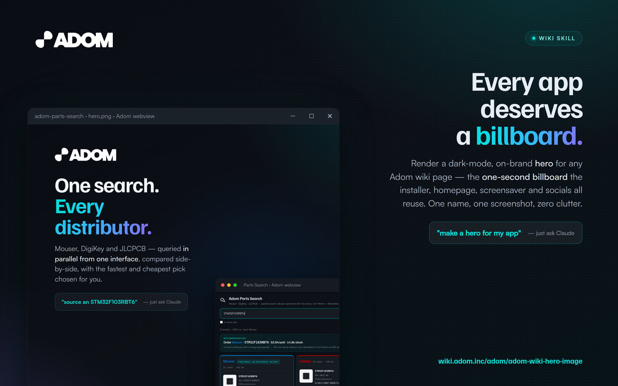
Design and render a billboard-grade hero image for any Adom wiki page — the 16:10 dark-mode image (set via page.json) that the wiki page, the landing grid, the Hydrogen Desktop installer, the homepage, and the screensaver all reuse. App name + value prop + one gorgeous shot of the real UI in a floating Windows-style webview window. Readable in one second.
Adom Wiki Hero Image
Design and render a billboard-grade hero image for any Adom wiki page. The 16:10, dark-mode
image — set via page.json — that the wiki page header, the landing grid card, the Hydrogen
Desktop installer, the wiki homepage, and the adom-screensaver all reuse
as a promotional billboard.
A hero is not a screenshot and not a brochure — it's a billboard. Picture it at highway speed: the viewer gets about one second. So it must read instantly: the app name, what it does, and one gorgeous shot of the real UI in a floating, drop-shadowed, Windows-style webview window. That's the whole job.
Why this skill exists
Without guidance, AI just shoves a boring screenshot into the hero — and every wiki page ends up looking the same. This skill flips the mindset to "convey this app's value proposition in one clean image." It gives Adom employees and third parties enough design guardrails that their hero is:
- Beautiful & on-brand — consistent type, color, and layout, drawn from the Kickstand brand guide.
- Unique to their app — picked layout × theme, a real screenshot, the headline, and a brand mark/chip make each hero distinct, so the wiki is a gallery, not a wall of clones.
Where these heroes run (so design them like ad creative)
The same image is reused, unchanged, as a billboard across many surfaces — so it has to stand alone:
- the wiki page header + landing grid card;
- the wiki homepage daily trending-apps slideshow;
- the adom-screensaver — auto-discovers public
hero.pngs and cross-fades them, so your hero literally runs as an ad on idle screens; - the Hydrogen Desktop installer setup steps;
- and increasingly YouTube / TikTok / Instagram / X.com posts.
Examples — heroes made with this recipe
This is the consolidated recipe behind the whole Adom app-page family. Same skill, same brand system, instantly distinct per app:
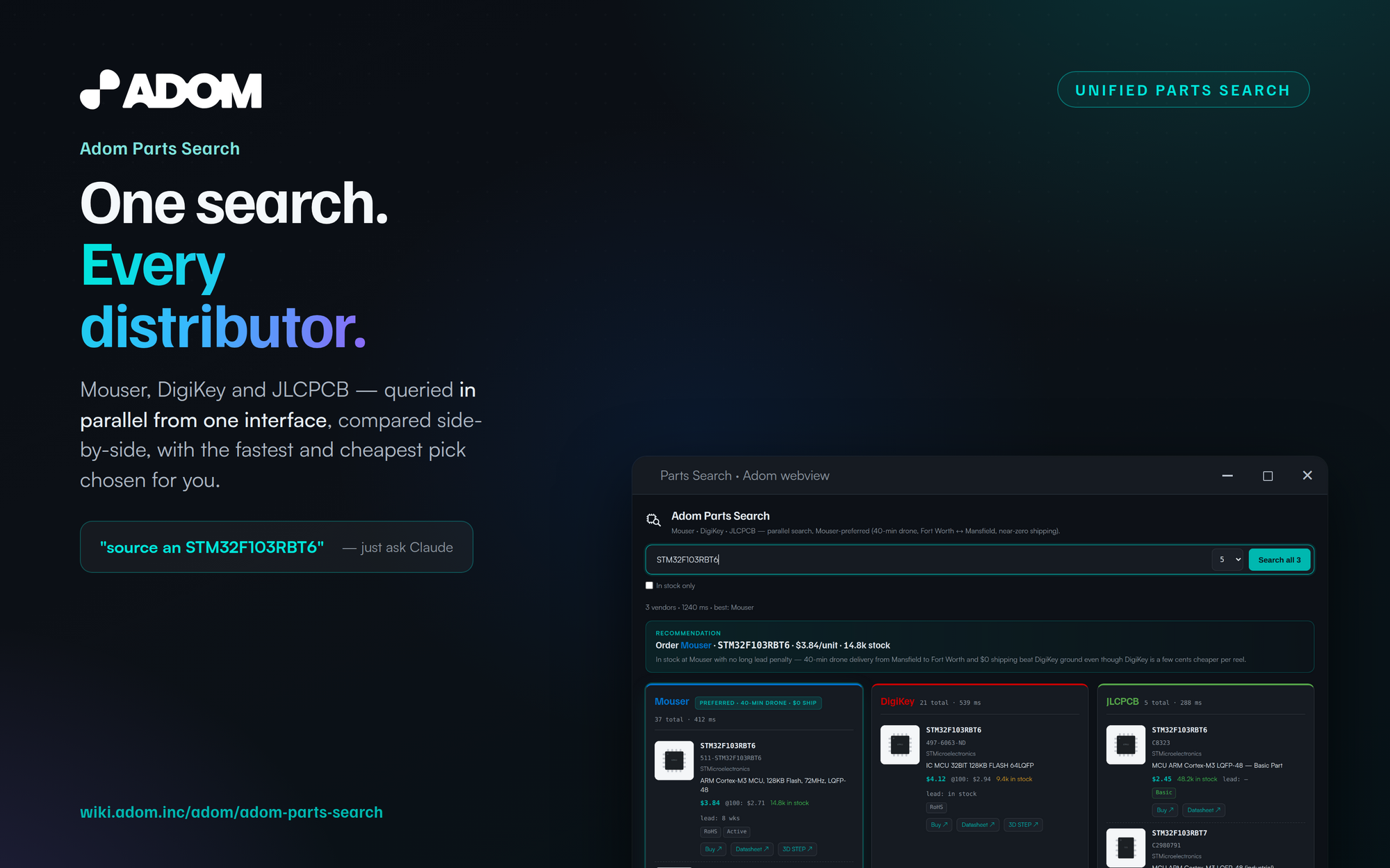 Tagline-led headline + category chip — the real
 ui.html populated with example MPNs.
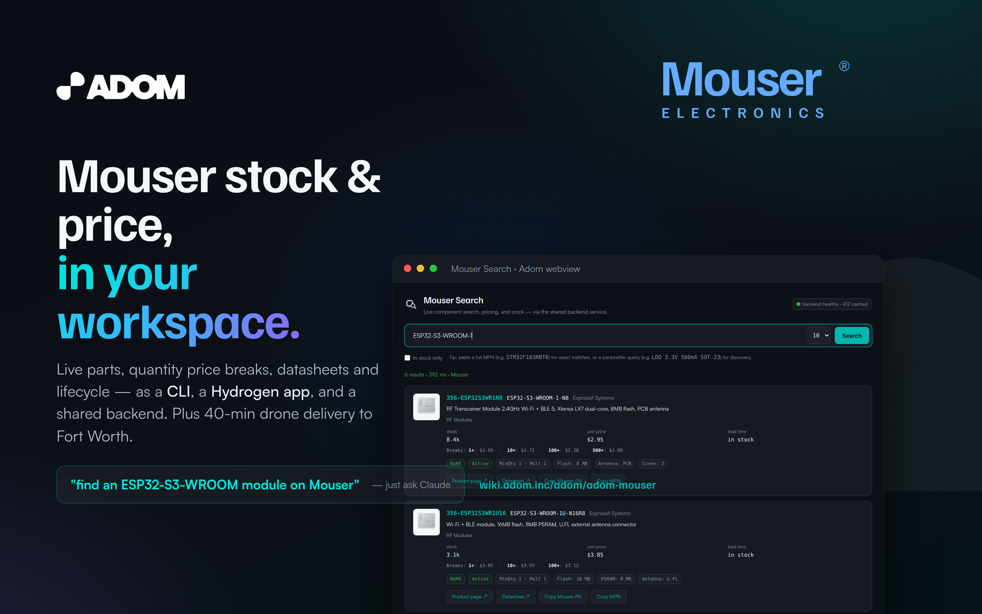 Brand-mark variant — the vendor wordmark recreated as a transparent, brightened-for-dark SVG.
Pick a look & feel — two axes, layout × theme
When you run this skill it asks you (via Claude's AskUserQuestion) to choose a layout and a
theme — they compose, so the same recipe makes a hero that's distinctly yours. Everything is drawn
from the Kickstand brand guide + tiling textures, all bundled with the skill.
Themes — background + Kickstand texture:
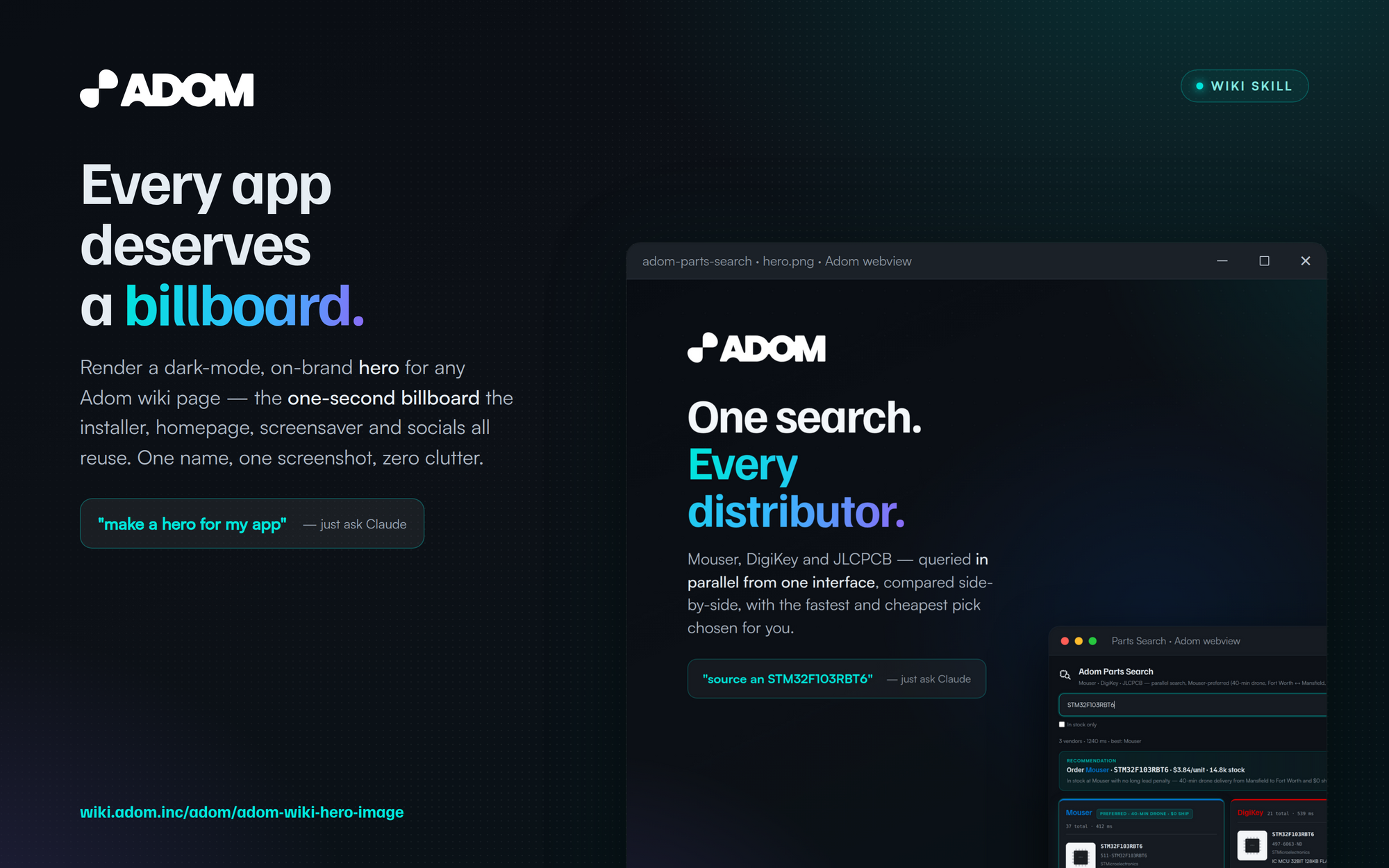 Midnight (default) — near-black + faint dot-grid. Neutral; lets the UI pop.
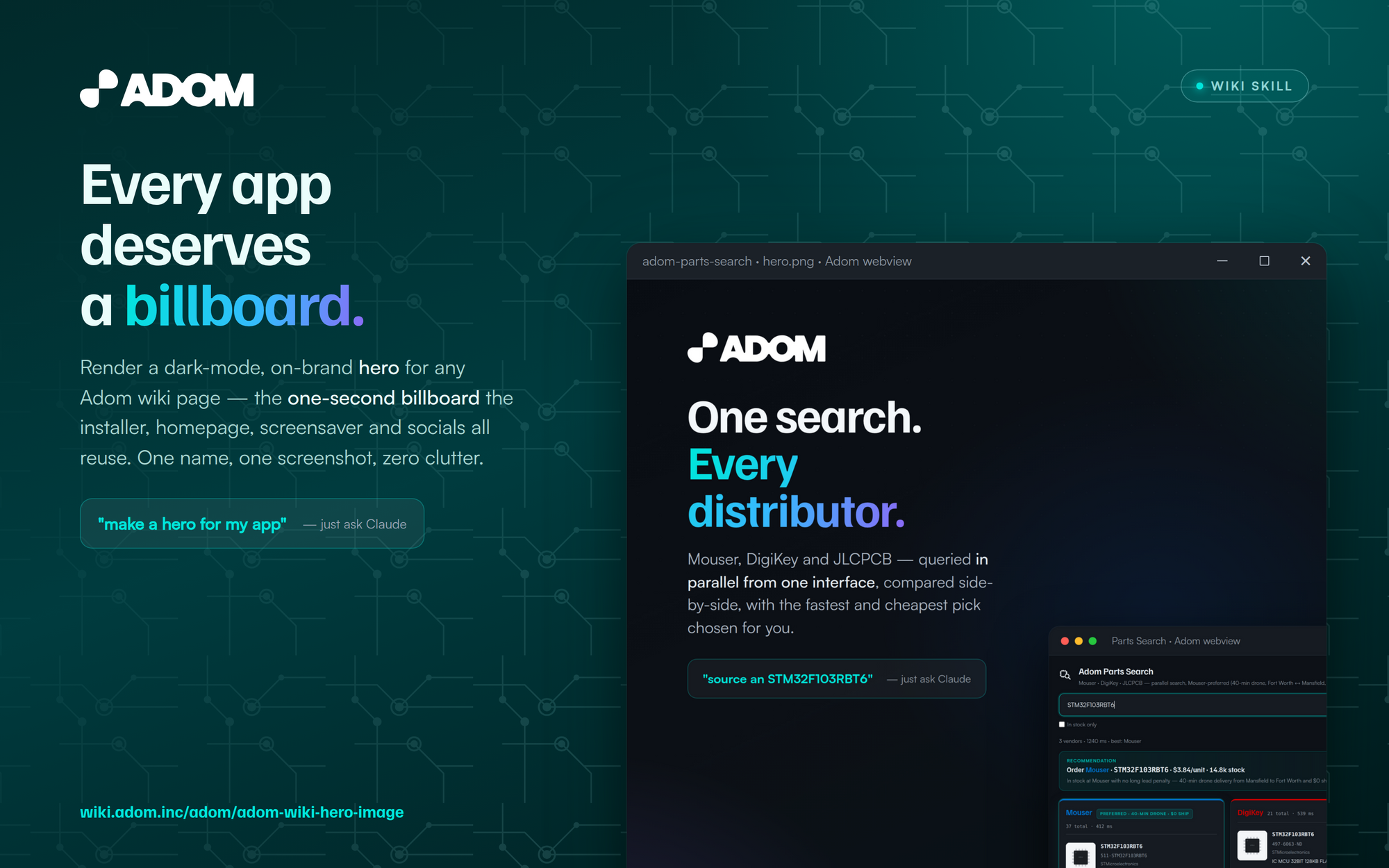 PCB Traces — deep brand teal + the Kickstand
 pcb-trace circuit field. Electronic/ethereal.
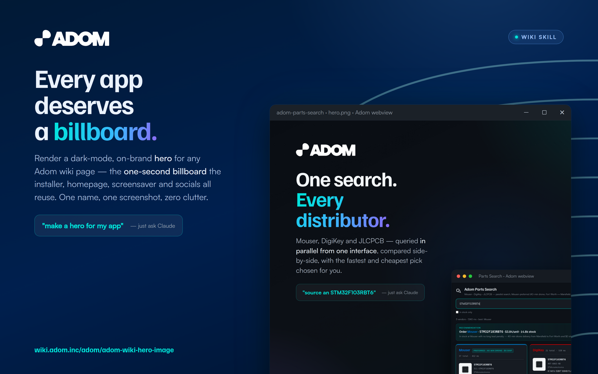 Onion — navy + the signature concentric-arc motif (the deck "substance" slide).
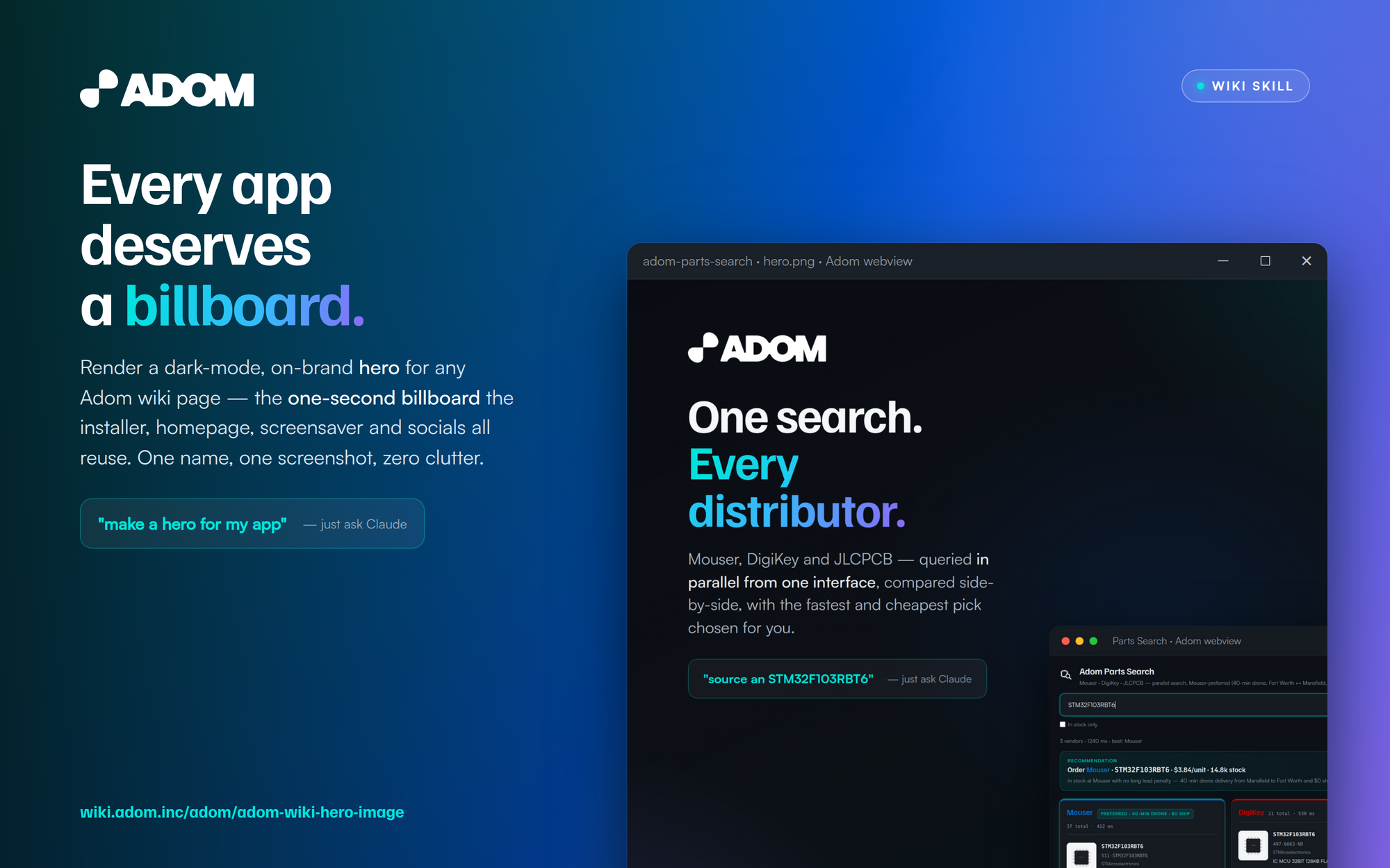 Gradient (wow) — the brand teal→blue→purple cover-slide gradient. For flagship/launch heroes.
Layouts — window treatment:
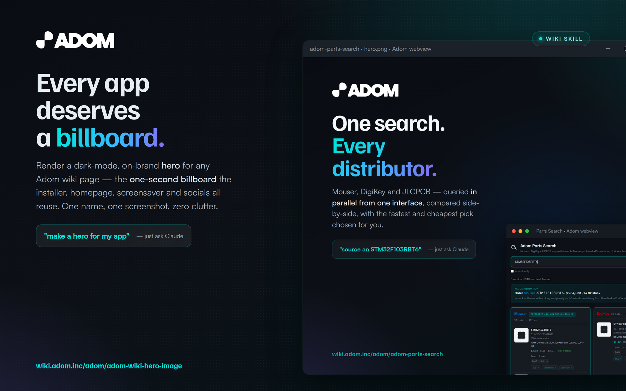 Bleed right — the window runs off the right edge as a tall panel.
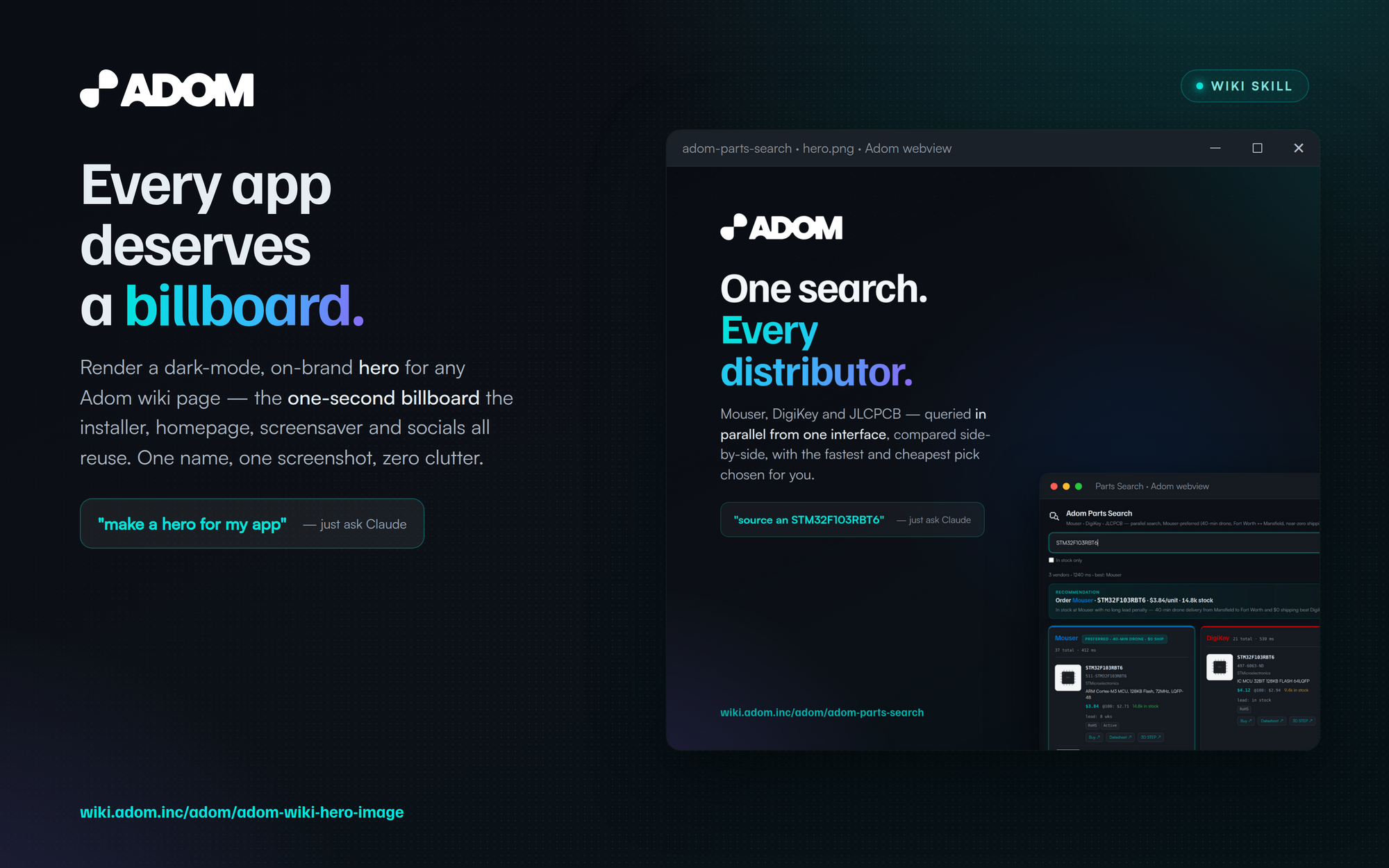 Contained — the whole window framed inside, margins top/right/bottom.
 Mirror — name/value-prop on the right, window on the left.
Mix any layout with any theme — e.g. Bleed-right × PCB, Contained × Gradient. Deck principle from Kickstand: gradient = emotional · solids = substance.
Install
adompkg install adom-wiki-hero-image
Installs the adom-wiki-hero-image skill to ~/.claude/skills/, bundled with its own brand fonts,
the ADOM wordmark, the render pipeline (render.js), and the fill-in-the-blanks hero.html
template — so it works with zero gallia dependency. Then just ask Claude.
Quick Start
Render any filled hero.html to a crisp 2× PNG, then downscale to the 2000×1250 deliverable:
CHROME=$(ls -d ~/.cache/puppeteer/chrome/linux-*/chrome-linux64/chrome | head -1)
CHROME=$CHROME node render.js hero.html 1600 1000 /tmp/[email protected] 2
convert /tmp/[email protected] -resize 2000x screenshots/hero.png
Set the hero in your page's page.json (NOT inline in the README):
"hero": { "type": "image", "path": "screenshots/hero.png" }
Features
- One-second read — app name + value prop + one screenshot. No collages, ever.
- On-brand by construction — the Adom dark gradient, the teal→blue→purple headline accent, Familjen Grotesk + Satoshi (bundled), the ADOM wordmark.
- Floating Windows-style webview window — min/max/close top-right (never macOS traffic lights), high-right, drop shadow + teal glow, bleeding off the bottom.
- Real UI, good data — renders the app's own
ui.htmlwith a realistic dataset; no dead mockups. - Two proven headline patterns — name-led, or tagline-led with a brand mark / category chip.
- Deterministic in-container render — Puppeteer + cached Chrome, external requests aborted, fonts/assets inlined. No desktop, no live backend, no flaky CDN fetches.
- Self-contained — bundles fonts + wordmark so an installed copy never reaches into gallia.
- Publish-ready — the exact
page.jsonhero field, versioned-filename CDN tactic, and the anon-verify steps, all documented.
Dependencies
This skill has zero adompkg dependencies — it deliberately vendors everything it needs so an
installed copy is self-contained.
| Dependency | Required? | Why |
|---|---|---|
| (none, adompkg) | — | Brand fonts + ADOM wordmark are bundled in assets/; nothing to install. |
| Puppeteer-managed Chrome | Render-time | Headless render of the hero HTML (the system chromium-browser snap stub is dead; use ~/.cache/puppeteer/chrome/*). |
ImageMagick (convert) |
Render-time | Downscale the 2× render to the 2000×1250 deliverable. |
Talk to the AI
Make / redo a hero
- "make a hero for my app"
- "make a billboard hero for this wiki page"
- "redo my hero, it looks too busy"
- "render
screenshots/hero.pngfollowing adom-wiki-hero-image and setpage.json"
See it
- "make a hero image and show it to me in pup"
Publish it
- "publish my hero — set
page.json, versioned filename, and verify it anon"
Use these words and Claude routes to this skill.
Skills
| Skill | Purpose |
|---|---|
| adom-wiki-hero-image | The full recipe: layout, brand tokens, render pipeline, the HTML/CSS template, how to get the real product screenshot, and the publish + QA checklist. |
How it works (the short version)
- Layout — two columns: text left (80–92px margin, ~520px wide), the app window high-right with a ≥~90px gutter. URL lower-left, ADOM mark top-left, chip/brand-mark top-right.
- Screenshot — render the app's own
ui.htmlwith realistic data (or frame a GUI/CLI window). - Render — fill
hero.html, runrender.jsat 1600×1000 @2×, downscale to 2000×1250. - Publish — push the PNG, point
page.json.heroat it, verify the anon image 200 + that the rendered page references it.
See SKILL.md for the full, copy-paste-ready recipe with all the hard-won rules.
# Adom Wiki Hero Image
**Design and render a billboard-grade hero image for any Adom wiki page.** The 16:10, dark-mode
image — set via `page.json` — that the wiki page header, the landing grid card, the Hydrogen
Desktop installer, the wiki homepage, and the [adom-screensaver](/adom/adom-screensaver) all reuse
as a promotional billboard.
A hero is **not a screenshot and not a brochure** — it's a billboard. Picture it at highway speed:
the viewer gets about **one second**. So it must read instantly: the **app name**, **what it does**,
and **one gorgeous shot** of the real UI in a floating, drop-shadowed, Windows-style webview window.
That's the whole job.
## Why this skill exists
Without guidance, AI just **shoves a boring screenshot into the hero** — and every wiki page ends up
looking the same. This skill flips the mindset to *"convey this app's **value proposition** in one
clean image."* It gives Adom employees and third parties enough design guardrails that their hero is:
- **Beautiful & on-brand** — consistent type, color, and layout, drawn from the Kickstand brand guide.
- **Unique to their app** — picked layout × theme, a real screenshot, the headline, and a brand
mark/chip make each hero distinct, so the wiki is a gallery, not a wall of clones.
## Where these heroes run (so design them like ad creative)
The same image is reused, unchanged, as a billboard across many surfaces — so it has to stand alone:
- the wiki **page header** + landing **grid card**;
- the **wiki homepage** daily **trending-apps slideshow**;
- the **[adom-screensaver](/adom/adom-screensaver)** — auto-discovers public `hero.png`s and cross-fades
them, so your hero literally runs as an **ad** on idle screens;
- the **Hydrogen Desktop installer** setup steps;
- and increasingly **YouTube / TikTok / Instagram / X.com** posts.
## Examples — heroes made with this recipe
This is the consolidated recipe behind the whole Adom app-page family. Same skill, same brand
system, instantly distinct per app:

*Tagline-led headline + category chip — the real `ui.html` populated with example MPNs.*

*Brand-mark variant — the vendor wordmark recreated as a transparent, brightened-for-dark SVG.*
## Pick a look & feel — two axes, layout × theme
When you run this skill it **asks you** (via Claude's `AskUserQuestion`) to choose a **layout** and a
**theme** — they compose, so the same recipe makes a hero that's distinctly yours. Everything is drawn
from the Kickstand brand guide + tiling textures, all bundled with the skill.
**Themes** — background + Kickstand texture:

***Midnight** (default) — near-black + faint dot-grid. Neutral; lets the UI pop.*

***PCB Traces** — deep brand teal + the Kickstand `pcb-trace` circuit field. Electronic/ethereal.*

***Onion** — navy + the signature concentric-arc motif (the deck "substance" slide).*

***Gradient (wow)** — the brand teal→blue→purple cover-slide gradient. For flagship/launch heroes.*
**Layouts** — window treatment:

***Bleed right** — the window runs off the right edge as a tall panel.*

***Contained** — the whole window framed inside, margins top/right/bottom.*

***Mirror** — name/value-prop on the right, window on the left.*
*Mix any layout with any theme — e.g. Bleed-right × PCB, Contained × Gradient.*
Deck principle from Kickstand: **gradient = emotional · solids = substance**.
## Install
```bash
adompkg install adom-wiki-hero-image
```
Installs the `adom-wiki-hero-image` skill to `~/.claude/skills/`, **bundled with its own brand fonts,
the ADOM wordmark, the render pipeline (`render.js`), and the fill-in-the-blanks `hero.html`
template** — so it works with zero `gallia` dependency. Then just ask Claude.
## Quick Start
Render any filled `hero.html` to a crisp 2× PNG, then downscale to the 2000×1250 deliverable:
```bash
CHROME=$(ls -d ~/.cache/puppeteer/chrome/linux-*/chrome-linux64/chrome | head -1)
CHROME=$CHROME node render.js hero.html 1600 1000 /tmp/[email protected] 2
convert /tmp/[email protected] -resize 2000x screenshots/hero.png
```
Set the hero in your page's `page.json` (NOT inline in the README):
```json
"hero": { "type": "image", "path": "screenshots/hero.png" }
```
## Features
- **One-second read** — app name + value prop + one screenshot. No collages, ever.
- **On-brand by construction** — the Adom dark gradient, the teal→blue→purple headline accent,
Familjen Grotesk + Satoshi (bundled), the ADOM wordmark.
- **Floating Windows-style webview window** — min/max/close top-right (never macOS traffic lights),
high-right, drop shadow + teal glow, bleeding off the bottom.
- **Real UI, good data** — renders the app's own `ui.html` with a realistic dataset; no dead
mockups.
- **Two proven headline patterns** — name-led, or tagline-led with a brand mark / category chip.
- **Deterministic in-container render** — Puppeteer + cached Chrome, external requests aborted,
fonts/assets inlined. No desktop, no live backend, no flaky CDN fetches.
- **Self-contained** — bundles fonts + wordmark so an installed copy never reaches into gallia.
- **Publish-ready** — the exact `page.json` hero field, versioned-filename CDN tactic, and the
anon-verify steps, all documented.
## Dependencies
This skill has **zero `adompkg` dependencies** — it deliberately vendors everything it needs so an
installed copy is self-contained.
| Dependency | Required? | Why |
|---|---|---|
| _(none, adompkg)_ | — | Brand fonts + ADOM wordmark are bundled in `assets/`; nothing to install. |
| Puppeteer-managed Chrome | Render-time | Headless render of the hero HTML (the system `chromium-browser` snap stub is dead; use `~/.cache/puppeteer/chrome/*`). |
| ImageMagick (`convert`) | Render-time | Downscale the 2× render to the 2000×1250 deliverable. |
## Talk to the AI
**Make / redo a hero**
- "make a hero for my app"
- "make a billboard hero for this wiki page"
- "redo my hero, it looks too busy"
- "render `screenshots/hero.png` following adom-wiki-hero-image and set `page.json`"
**See it**
- "make a hero image and show it to me in pup"
**Publish it**
- "publish my hero — set `page.json`, versioned filename, and verify it anon"
Use these words and Claude routes to this skill.
## Skills
| Skill | Purpose |
|---|---|
| **adom-wiki-hero-image** | The full recipe: layout, brand tokens, render pipeline, the HTML/CSS template, how to get the real product screenshot, and the publish + QA checklist. |
## How it works (the short version)
1. **Layout** — two columns: text left (80–92px margin, ~520px wide), the app window high-right with
a ≥~90px gutter. URL lower-left, ADOM mark top-left, chip/brand-mark top-right.
2. **Screenshot** — render the app's own `ui.html` with realistic data (or frame a GUI/CLI window).
3. **Render** — fill `hero.html`, run `render.js` at 1600×1000 @2×, downscale to 2000×1250.
4. **Publish** — push the PNG, point `page.json.hero` at it, verify the anon image 200 + that the
rendered page references it.
See [SKILL.md](/blob/skill/adom-wiki-hero-image/skills/adom-wiki-hero-image/SKILL.md) for the full,
copy-paste-ready recipe with all the hard-won rules.