Adom UI Design System
Public Made by Adomby adom
How the AI builds and tests interfaces people love to use in Adom. Ships as one installable skill that bundles focused skills (tooltips, floating-windows, toasts, responsive-ui, app-shell, ai-driven-apps).
Install?
The Adom UI Design System plus a bundle of focused UI skills (tooltips, floating-windows, toasts, responsive-ui, app-shell, ai-driven-apps). One adompkg install drops the whole set of skill files onto your container.
adom-wiki pkg install adom/adom-ui-designLatest: v1.3.11, published
Contents
- The contract
- 1. How a UI is built and tested in Adom
- The three display surfaces
- 2. The live channel: driving and observing
- Ralph-testing the UI
- Reaching a container app from outside
- 3. Interaction and feedback
- Every action answers back
- Toasts, for the user and for the AI
- Controls that explain themselves
- Tooltips (desktop)
- Buttons, toggles, and previews
- Floating tool windows and HUDs
- A note on animation
- 4. Responsive and touch
- 5. The app header
- 6. CLIs and hints
- 7. 3D viewers
- The measure tool
- 8. Foundations: color
- Core theme tokens
- Status and grouping
- 9. Foundations: type, spacing, and icons
- 10. Hero images
- 11. Copy and voice
- 12. The enforcement gate
- 13. The skill map
- Talk to the AI
Adom UI Design System
How the AI builds and tests interfaces that people genuinely love to use. In Adom you do not hand-write an app and then click through it to check it. You ask the AI to build it, and the AI builds it, shows it to you, drives it over a live channel, watches the result, and fixes it, looping until the experience is right. This page is the standard that makes that loop land on something pleasurable: a UI that treats the person using it as the center of everything, and an app that is built from the first commit to be driven and observed. Color and typography are the final polish, maybe three percent of the work. The rest is interaction quality and drivability.
Why this page exists. Two things are true in Adom that are not true elsewhere. First, good UI is not decoration, it is respect for the person on the other side of the screen. Second, the AI is the one building and driving the UI, so the app has to be controllable and observable end to end, or the AI cannot perfect it. This page teaches both: how to make an interface a pleasure to use, and how to build and test it the Adom way. If you only remember one thing: build for the user first, make every action answer back, and make the whole app drivable so the AI can prove it.
The contract
The principles that matter most, in order. Usability and drivability first, polish last.
- Put the user at the center. Every screen answers three questions at a glance: what is this, what can I do here, and what just happened.
- Every action answers back. A toast, a state change, or a live preview. Never a silent click, never a spinner with no end, never a dead end.
- Controls explain themselves. Every control says what it does and what changes, in a tooltip on desktop and inline on touch.
- Errors are help, not blame. Say what went wrong and the exact next step. Destructive actions say what is kept and offer an undo.
- Adapt to the screen. Rich and dense on a desktop, lean and thumb-friendly on a phone. The same app reshaped, never a cramped desktop layout squeezed onto mobile.
- Built and driven by the AI. The AI writes the app, shows it to you, and drives it over a live SSE or WebSocket channel to test and perfect it. Anything the UI can do, a command can do, so state lives on the server and the channel keeps the UI, the CLI, and the AI in lockstep.
- One 44px header, three zones, so people always know which app they are in and where the controls are.
- CLIs answer
OK:orERROR:, with aHint:that names the exact next command. - Then the polish: dark
#0d1117and#161b22, one teal accent#00b8b0, monochrome-white icons, three fonts by role. Never emoji, never em-dashes (section 11). On-brand matters, but it comes last. - Lint before you publish.
adom-ui-linterturns most of this into deterministic checks.
1. How a UI is built and tested in Adom
This is the loop the whole system is designed around. The AI is both the builder and the tester, the user watches and steers.
- The AI builds the app: a small server plus a webview UI, made AI-drivable from the first commit (state on the server, a live channel, a CLI).
- The AI shows it to the user in one of three surfaces (below), chosen for what is being tested.
- The AI drives the front-end over the live channel to exercise every path: click each button in turn, open and close the floating toolbar, load a different symbol or footprint, hit "send to KiCad", and read back state, the console buffer, and screenshots.
- The AI ralph-loops: screenshot, analyze what looks wrong, fix the code, reload, repeat, until the UI is correct and a pleasure to use.
- The AI narrates what it is doing through toasts and the chat, so the user can follow the test as it happens.
The design rules on this page exist so that this loop converges on something a person loves, not merely something that runs.
The three display surfaces
The AI picks the surface by what it needs to test, and it can use more than one at once.
| Surface | What it is | Use it for |
|---|---|---|
| Native browser | The user's own Chrome or Edge, driven through Adom Desktop | The real, signed-in experience. The browser is already the user's, so the app opens logged in with zero friction. Huge for demoing and testing anything behind a login. |
| pup | A clean, scriptable Chrome the AI fully owns, via adom-desktop |
The fresh, logged-out, first-time-user experience, and automated screenshot loops that should not fight the user's own tabs. |
| Hydrogen webview | An in-workspace browser tab | Showing a result inside the workbench, next to the code and the chat. |
The native-browser and pup split is the point: the AI can open the logged-in path in the native browser (real cookies) and the logged-out path in pup at the same time, and verify both experiences. Choose deliberately, and tell the user which one and why.
2. The live channel: driving and observing
The spine that makes the loop possible. Build it into every app.
- State lives on the server. The UI never keeps its own copy of "am I recording?" or "which symbol is loaded?". Buttons fire commands to the server, the server owns the truth.
- A live channel pushes state to everyone. Expose Server-Sent Events for one-way push, or a WebSocket for two-way. The UI subscribes and updates the instant anything changes. The CLI subscribes too. A 300 to 500ms poll of
GET /stateis the minimum fallback, but the live channel is what makes driving feel instant. - The channel is two-way, so the AI drives the front-end from the CLI. Every user-visible action has a command that does exactly what the click does:
Each command drives the real UI through the same path a user would, so the AI can walk every interaction, assert the resulting state, screenshot it, and move on. This is the test harness and the demo driver in one.mytool ui click "send-to-kicad" # press a button mytool ui toolbar show # reveal the floating toolbar, then `hide` mytool ui load-symbol LM358 # swap the loaded symbol or footprint mytool ui toast "file downloaded" # raise a toast (see section 3) - Observe, do not scrape. Expose
GET /statefor current state andGET /consolefor the app's log: overrideconsole.log/warn/errorto also post to the server, keep a ring buffer, and catchwindow.onerrorandunhandledrejection. Now the AI reads what the UI is doing without DevTools. - The acceptance test: an AI driving the app over the channel and a person clicking the UI produce identical visible results.
Ralph-testing the UI
The visual feedback loop that turns "it runs" into "it is right": edit, reload, drive a step over the channel, screenshot, read the console buffer, analyze, fix, repeat. Drive it in pup (or the native browser), capture each frame to the screenshot log, and keep looping until the UI looks and behaves correctly. This is how the AI debugs UI with no human in the loop, and it is also the proof that the app is genuinely drivable.
Reaching a container app from outside
- A webview and a browser window both render outside the container, so they cannot reach
http://localhost:<port>orhttp://127.0.0.1:<port>. Always use the public proxy URL:https://<slug>.adom.cloud/proxy/<port>/. - Inside a webview, always use relative URLs. A leading slash resolves to the host origin and bypasses the proxy. Every
fetch,href,src, and CSSurl()must be relative.
3. Interaction and feedback
An interface that responds, explains, and forgives is the difference between a tool people tolerate and one they enjoy. It is also what the AI drives and verifies in the loop above.
Every action answers back
- Immediate visible feedback on every action: a toast, a class change, a live preview, a progress line. A click that produces no visible response reads as broken, to a person and to the AI watching the screenshot.
- Show, do not block. Long work shows progress and stays interactive where it can. A bare spinner with no estimate is a last resort.
Toasts, for the user and for the AI
Toasts are the standard transient-feedback element, and in Adom they do double duty: because the AI is driving the front-end, a toast is also how the AI talks to the user live, on top of the running app, during a test or a demo. "Running test 3 of 8", "file downloaded", "loaded LM358, re-routing", all land as toasts over the app rather than buried in chat.
- Build a
POST /ui/toasthook from day one. One mechanism serves both the user (feedback) and the AI (narration). The AI raises a toast with the samemytool ui toast "..."command it uses to drive everything else. - Position: bottom center, consistent across the app.
- Types: success (green
#3fb950), error (red#f85149), info (teal#00b8b0), each with a clear icon and message. - Duration: about 4 seconds for a confirmation, sticky for an error the user must read. Pause on hover.
- Stack newest on top, cap the visible count, allow dismiss, and carry an action when one exists, above all Undo for anything destructive.
Controls that explain themselves
- Every interactive element carries an explanation. On desktop this is a tooltip, on touch it is inline helper text or a tap-to-reveal sheet, because hover does not exist on a phone (section 4).
- A good explanation says what the control does, what changes after the action, what is and is not preserved for anything destructive, and it spells out jargon for a newcomer.
Tooltips (desktop)
- Body-appended
position:fixedelements atz-index:99999. Never a CSS::afterpseudo-element, which gets clipped by paneloverflow:hidden,backdrop-filter, ortransformstacking contexts. - Reveal after a 600ms hover delay so a fast cursor fly-by stays quiet. Motion is a short fade plus translate,
0.18s ease. - Anchor near the cursor, offset about 14px into a quadrant that does not cover the cursor or the hovered element. Flip on-screen near an edge. Reset
text-transform:none.
Buttons, toggles, and previews
- A toggle must look like its state. Flat styling for both on and off is a lie.
- Primary actions use teal
#00b8b0. Green means success, red means destructive, reserved for those meanings. - Any irreversible-feeling action gets a live preview before it commits: a snap point, a deletion glow, a highlighted target.
Floating tool windows and HUDs
- Draggable by a visible grip, never clamped to a screen edge. The AI can show and hide them on command to test them.
max-height: calc(100% - margin)with internal scroll and a pinned header and footer. Offer minimize, close, and double-click to collapse.
A note on animation
When several iterations of the same animation each help only a little, stop tuning and reframe. The fix for a janky content fade is usually not a smoother content fade, it is to cover the content with a solid block, let it paint underneath, then fade the block off. Animate a trivial proxy, not the expensive thing.
4. Responsive and touch
The same app should feel native on a 32 inch monitor and on a phone.
- Design the layout to reshape, not to shrink. Define a few breakpoints (phone, tablet, desktop) and change the layout at each, rather than scaling one fixed desktop layout down until it is unusable.
- Rich on desktop, focused on mobile. A desktop has room for side panels, dense tables, persistent toolbars, secondary stats. On a phone, collapse those into a single column, move actions into a bottom bar or a menu, and reveal secondary detail on demand. The header models this already: the subject meta line hides below roughly 720px and returns on request.
- Touch targets are at least 44 by 44 px. Fingers are not cursors.
- Hover does not exist on touch, so tooltips cannot be the only way to learn a control. Under
@media (hover: none), (pointer: coarse), replace hover tooltips with a visible label, a tap that reveals an info sheet, or a long-press. Never hide essential meaning behind a hover a phone can never trigger. - Respect the safe areas and the soft keyboard. Keep primary actions reachable with a thumb, and do not let the keyboard cover the active field.
- Test every app at a phone width before publishing, not just at desktop. The AI can resize the pup window to a phone viewport and ralph-loop the mobile layout too.
5. The app header
Every Adom app wears the same header so a person always knows which app they are in and where the controls are. It is a single row, 44px tall, three zones.
[ icon  app-name · subtitle ] | [ Subject Name  meta ]            [ btn btn ]
        brand (left)            vsep      subject (center)          actions (right)
- Brand zone (left): a 16x16 monochrome icon, the app name, a middot, a one to four word subtitle, in Familjen Grotesk 600 and the accent color. Hovering it reveals an app-info popover (version, build date, engine, author, clickable wiki link); none of that sits in the row itself.
- Subject zone (center): the current document or object name (bold, ellipsis-truncated when narrow) plus a muted monospace meta line for secondary stats that hides below ~720px and returns on hover or tap.
- Actions zone (right): icon buttons only, right aligned with
margin-left:auto. Skip it if there are none. - A
1pxvertical hairline separates brand from subject.
Never a multi-row or sticky header, never the version inline, never the app name in monospace or all caps. The hover popover must be reachable: pointer-events:auto, a 600ms show delay, a ~220ms hide grace. Copy the canonical block from the adom-app-header skill.
6. CLIs and hints
Most Adom tools ship a CLI, usually in Rust, and the CLI is both the AI's driving wheel for the front-end (section 2) and how it recovers when a skill scrolls out of context. The output format is a contract.
- Every response starts with
OK:orERROR:, so the AI knows instantly whether it worked. - Every error carries at least one
Hint:that is an actionable command, not an explanation.
Hints name the exact command, flag, or file, and chain for multi-step recovery. A hint read at the moment of need steers an AI far more reliably than a skill read once and forgotten.ERROR: Cannot connect to the server on port 8820. Hint: Start it with `mytool serve &` - Strip ANSI color when stdout is not a TTY. Gate every color on an
isattycheck. - Ship
healthandinstallsubcommands.installfetches the latest skill from the wiki rather than relying on an embedded copy. - Relay servers gate on User-Agent. The CLI sets
User-Agent: <tool>-cli/<version>; the relay rejects anything else with a structured hint telling the caller to use the CLI. - Build the front-end driving subcommands (
ui click,ui toolbar,ui load-*,ui toast) as first-class CLI verbs, each wired to the live channel, so driving the UI is as scriptable as any other command.
7. 3D viewers
Adom has many 3D viewports: CAD, PCB, mechanical, component preview. They share one design so they feel like one tool, and they are driven the same way (the AI can load a different model or click a viewer tool over the channel).
- Babylon.js, always. Never Three.js. Better PBR materials, GLB fidelity, a first-class orbit camera, and a built-in ViewCube.
- Start from the canonical Adom Babylon viewer. Embed, import, or extend it before rolling your own. If you roll your own, you inherit every rule below.
- Background is a vertical gradient, never a flat color. Pure black hid black IC bodies in the lower frame. Dark mode default, light mode toggle required.
- Dark:
linear-gradient(180deg, #1e2a3d 0%, #1e2a3d 20%, #0a121f 100%) - Light:
linear-gradient(180deg, #5a6b7e 0%, #5a6b7e 20%, #2a3340 100%)
- Dark:
- Zoom to cursor is non-negotiable:
camera.zoomToMouseLocation = true. - Two lights minimum, never a single-light rig: HDRI environment plus a hemispheric light, with a bottom-light toggle for dark parts.
- World-origin axis helpers default on (X red, Y green, Z blue), a screen-space corner triad always visible, a ViewCube in the top-right. Do not rebuild the buttons the ViewCube already provides.
- Camera limits are soft, and wheel, pan, and pinch precision adapt to model size on each load.
The measure tool
Match Fusion 360 and SolidWorks: live hover preview, not click-only; smart-pick edge then face then vertex; the committed marker matches the preview; dimension line distinct from markers (markers teal #00B8B1, line blue #64ABFF); millimeters primary with mils secondary, never inches; Esc is multi-stage (pop last pick, then the previous, then close).
8. Foundations: color
The finishing tokens. They make an app on-brand once the interaction is already right. Adom is a dark system, and color is used sparingly so the one teal accent always means "this is interactive or important."
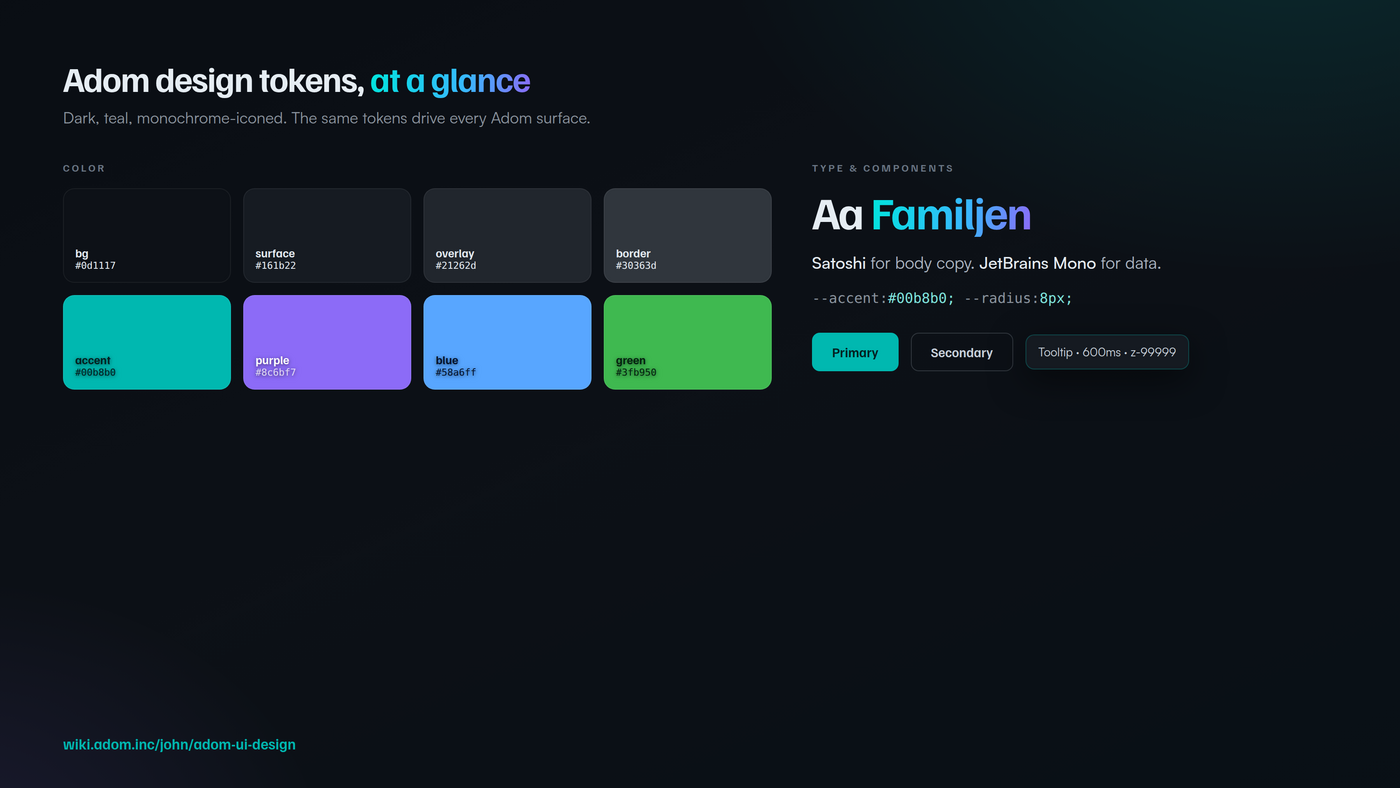
Core theme tokens
| Token | Value | Use |
|---|---|---|
--bg |
#0d1117 |
Page, deepest background |
--surface |
#161b22 |
Panels, toolbars, cards |
--elevated |
#1c2128 |
Elevated cards, hover surfaces |
--overlay |
#21262d |
Tooltips, dropdowns, modals |
--border |
#30363d |
Standard border |
--text |
#e6edf3 |
Primary text |
--text-2 |
#8b949e |
Secondary text, labels |
--text-3 |
#484f58 |
Disabled, placeholders |
--accent |
#00b8b0 |
Primary accent, the Adom teal |
--accent-bright |
#00e6dc |
Hover and focus highlights |
Status and grouping
| Token | Value | Use |
|---|---|---|
--purple |
#8c6bf7 |
Group labels, secondary accent |
--blue |
#58a6ff |
Links, informational accents |
--green |
#3fb950 |
Success only |
--red |
#f85149 |
Destructive only |
--yellow |
#d29922 |
Warning only |
- Never use pure black (
#000) or pure white (#fff) for a large surface. - Hover transitions are smooth, not snappy:
0.15s ease. - Signature gradient, teal to blue to purple:
linear-gradient(100deg, #00e6dc, #39b8ff 60%, #8c6bf7). Headline accents and flagship art, not body UI.
9. Foundations: type, spacing, and icons
| Face | Weights | Job |
|---|---|---|
| Familjen Grotesk | 500, 600, 700 | Headlines, app name, section headers, identity |
| Satoshi | 400, 500, 700 | Body copy, descriptions, paragraphs |
| JetBrains Mono | 400, 500 | Source code, inline code, numeric and data rows |
- Monospace is only for code and data. A version number or a pad count is data, so it is mono. A button label is not.
- Never ALL CAPS body text. Small uppercase is fine for tiny eyebrow labels and chips, never for sentences.
- Do not fall back to Inter, Arial, Helvetica, or the system stack as the primary face. Load the brand fonts from
https://adom.inc/fonts/. - Spacing grid: 8px, 12px, 16px. Radius:
8pxfor buttons and cards,12pxfor larger containers,999pxfor pills. - Icons are monochrome white. No exceptions.
#e6edf3orcurrentColor, in-app icons, the tab-strip icon, and the favicon. Prefer a clean custom SVG (viewBox="0 0 24 24", stroke 1.5 to 2px). No emoji as icons. The only place brand color is allowed is marketing art: the hero and the page thumbnail.- Pre-publish icon audit, both must return zero hits:
grep -nE 'fill="(#00b8b0|#00d4cb)"|stroke="(#00b8b0|#00d4cb)"' docs/icon.svg src/**/*.html src/**/*.svg
grep -nE '\.logo[^{]*\{[^}]*color:\s*var\(--accent\)|\.icon[^{]*\{[^}]*color:\s*var\(--accent\)' src/**/*.html src/**/*.css
- Pre-publish icon audit, both must return zero hits:
10. Hero images
A hero is the 16:10 billboard at the top of a wiki page, reused on the page header, the landing card, the installer, the homepage, and the screensaver. It has to read in about one second and sell the outcome, not the brand.
- One app, one screenshot. No collages.
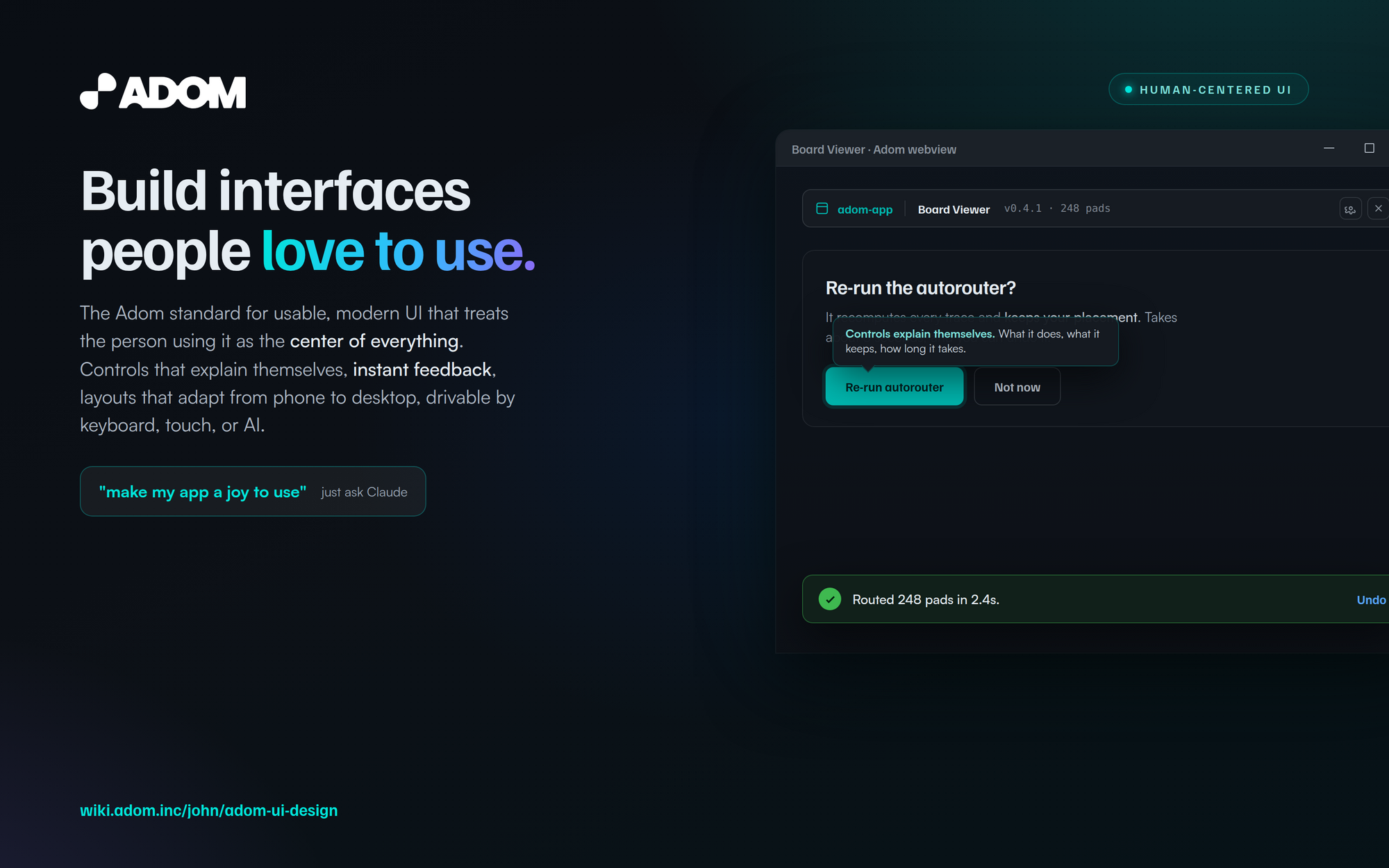
- Lead with the value, not the logo. The headline is the outcome a person gets, with the signature gradient on one key word, plus a one-line value prop with a couple of words bolded white.
- Show a real, friendly app moment with realistic data, ideally one that demonstrates the experience: a clear action, a helpful tooltip, a success toast.
- The product sits in a floating window with a drop shadow, bleeding off the bottom, with Windows-style chrome (minimize, maximize, close at the top right), never macOS dots.
- Margins are sacred: every element at least 80px from the edge, real separation between text and window.
- The call to action is an AI prompt, for example
"make my app a joy to use", not a shell command.
The adom-wiki-hero skill renders this from a template.
11. Copy and voice
The words are part of the experience, and the first two rules here are absolute, because breaking them makes an Adom app look unprofessional or machine-made.
- No emoji. Anywhere. Not in copy, not on buttons, not in toasts, not in headings, not as icons. Colorful emoji are lame and childlike, and they turn a serious tool into a bowl of Skittles. Adom apps use monochrome line icons (section 9), never emoji. This is a hard rule, not a preference.
- No em-dashes or en-dashes. Ever. They are the clearest tell of machine-written text, and an app full of them reads as AI slop, which makes users distrust everything else in the product. Use commas, colons, periods, parentheses, or "to" for ranges (for example, "2 to 3 minutes").
- Write for the person, plainly. Say what a thing does and what will happen, in their language, not the system's.
- Name products by their short name, never with the tagline baked in.
- Lead with the value the user gets. Tone is professional, for engineers and serious makers.
- Provenance over magic: a computed view shows where its data came from and never silently auto-corrects.
12. The enforcement gate
Reading this page is step one. Proving an app follows it is adom-ui-linter, which encodes most of these rules as roughly 50 deterministic checks.
| Category | Checks |
|---|---|
| ui-patterns | tooltips body-appended and not ::after, feedback on actions, toast hook, toggle state, color tokens, no all-caps |
| ai-drivability | GET /state, GET /console, live channel, front-end driving commands, relay User-Agent gate, CLI hints |
| header | 44px height, brand and subject zones, fonts, popover, favicon |
| cli-compliance | OK:/ERROR: prefix, Hint: lines, health and install subcommands, isatty gating |
| skills-docs | skill frontmatter and triggers, README with inline screenshots |
| build-publish | version files in sync, release profile, port registration |
adom-ui-linter lint . --category ui-patterns,ai-drivability,header
Fix every FAIL (the hint tells you exactly what to do), address relevant WARNs, re-run to zero before publishing.
13. The skill map
This whole system ships as one installable skill. adompkg install adom-ui-design drops the design-system skill plus all seven skills below onto your container as separate skill files, so the AI loads each by its own trigger words. The first seven live as files in this repo; click to read them. The rest are existing platform skills.
| Skill | Governs |
|---|---|
| tooltips | Great desktop tooltips: 600ms reveal, the fixed-div renderer, placement that never covers what you hover, edge-aware flipping, the z-index ladder |
| floating-windows | Draggable floaty tool windows and HUDs that never get in the way |
| toasts | Non-blocking confirmations, and the AI's live narration channel to the user |
| responsive-ui | Phone-to-desktop layouts, touch targets, and tooltips on touch where hover does not exist |
| app-shell | The full-height single-page app shell, the footer / status bar, and the sizing traps |
| ai-driven-apps | The build-show-drive-ralph loop, the live SSE/WebSocket channel, the three display surfaces |
| skill-authoring | How to author a new Adom skill set as a bundle: many skill files in one repo, never a repo per skill |
| human-ui-patterns | The broader user-first interaction primitives these were extracted from |
| app-creator | Scaffolding a webview app: two-way comms, proxy URL, favicon, publish flow |
adom-app-header |
The 44px three-zone header and the app-info popover |
| adom-screenshot | Ralph loops and the visual feedback loop for debugging UI |
pup-vs-webview / adom-desktop-pup |
Choosing and driving pup, webview, or the user's native browser |
| adom-cli-design | The OK:/ERROR:/Hint: CLI contract, in Rust |
ai-hints-in-clis / relay-hint-pattern |
Writing hints, and redirecting direct HTTP callers to the CLI |
3d-viewer-design / measure-tool-design |
Every rule for Adom 3D viewports and measurement |
| adom-panels / adom-workspace-control | The panel catalog and safe workspace layout control |
| carbon-preferences | Per-user settings that persist across sessions |
| brand | Colors, typography, logo, the icon law, the dark theme tokens |
adom-wiki-hero |
Rendering a billboard-grade hero image |
| adom-ui-linter | The deterministic check suite that enforces this page |
(The first seven are files in this repo and install together with the design system. The other linked skills are existing platform skills with their own pages; plain-text ones have no standalone page yet.)
Talk to the AI
You drive all of this by asking. Useful prompts:
Build
- "build me an Adom webview app for X that is a joy to use"
- "make this app fully drivable from the CLI over a live channel"
- "make this app work well on a phone, not just desktop"
Test and drive
- "show me the app in my native browser so it is already logged in"
- "open it in pup and test the logged-out experience"
- "ralph-test this app: click every button and show me where the UI breaks"
- "auto-click send-to-kicad and toast me when the file is downloaded"
Improve
- "make my app a joy to use"
- "add instant feedback and toasts to every action"
- "lint my app against the Adom UI rules"
Adom UI Design System. The AI builds it, drives it, and perfects it, around a user who is the center of everything.